It’s that time of year when our social media feed is bursting with Pantone Colour of the Year content.
(Well, it is if design, trends, fashion or anything akin to these worlds tickle your fancy).
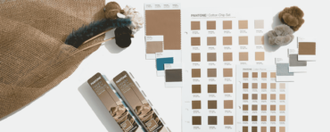
Every year, the Pantone Color Institute crowns a single hue as a forecast for the year to come. This singular shade is not just about aesthetics, but rather a reflection of international trends, emotions, and aspirations. The company has been the global authority for colour communication and inspiration since 1963.
Many industries, from fashion runways to design showrooms, await the release of the Pantone Colour of the Year to set the tone (literally) for upcoming releases.
But as a humble homeowner, should this carefully chosen hue even matter?
At Comfort Works, we believe in transforming your home in ways that suit your style — not just trends.
That’s why our custom slipcovers come in a variety of colours and fabrics, making it easier to explore styles you enjoy without committing to permanent changes.
Let’s take a closer look to determine if 2025’s pick deserves a place in your sanctuary.
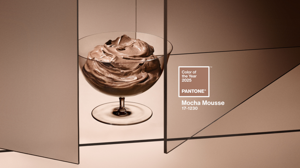
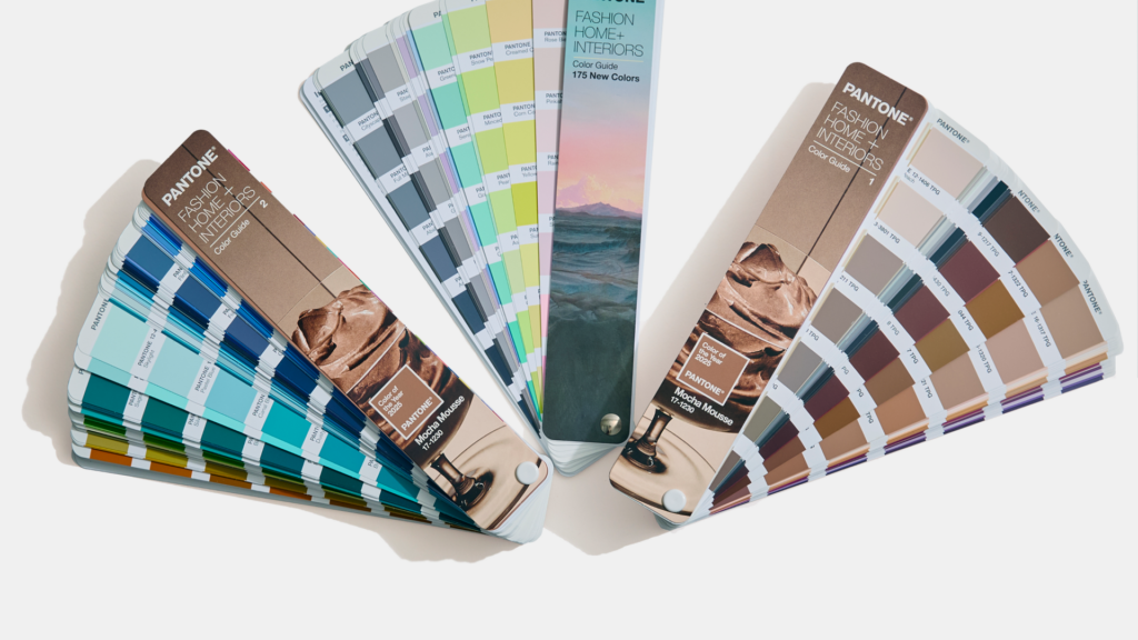
Pantone Colour of the Year 2025 is Mocha Mousse. (Image credit: Pantone)
Pantone Colour of the Year 2025: Mocha Mousse
Remember Brat green — An energetic, practically radioactive colour which dominated 2024?
Meet its polar opposite: Mocha Mousse.
In the same calming vein as the 2024 pick (Peach Fuzz), Mocha Mousse feels neutral.
This shade is a warm, rich brown, reminiscent of cream and chocolate whipped into a foam.
It makes you think of nourishment — from your morning coffee and chocolate treat in the afternoon to the nature you spot on your afternoon walk.
Even the name, Mocha Mousse, gives off a sense of decadence and softness.
“Underpinned by our desire for everyday pleasures, PANTONE 17-1230 Mocha Mousse expresses a level of thoughtful indulgence” says Leatrice Eiseman, Executive Director Pantone Color Institute.
This shade lends itself to a sense of luxury, but not in an ostentatious or in-your-face way.
In fact, The Washington Post claims that this year’s Pantone Colour of the Year is a triumph for quiet luxury.
Over the last year, shades of brown and beige have come to be representatives of understated elegance.
They are reserved for those with buckets of money but refuse to be crass about it.
It brings to mind terms such as “old money” and “understated”.
“Sophisticated and lush, yet at the same time an unpretentious classic,” adds Eisman.
“PANTONE 17-1230 Mocha Mousse extends our perceptions of the browns from being humble and grounded to embrace aspiration and luxe.”
What humble and grounded beginnings does Eisman refer to?
In terms of textiles, brown was the colour of the humble and lowly across Europe in the Middle Ages.
Brown vegetable-dyed cloths were cheaper to produce than colourful inks.
In more recent history, this particular shade of brown was often associated with being drab, or boring.
There are even Reddit pages debating whether this colour is worth their time, calling it “sad beige”.
In spite of this being Pantone’s chosen hue, designers have decided to opt for louder and more vibrant colours.
These Rebel Pantone Colour of the Year picks, so called by Forbes, range from burnt ochre and mustard gold to multiple shades of blue.
However, not all of us want loud and striking colours to fill our spaces. In a way, Mocha Mousse can bring balance — like a tame sidekick to a rambunctious lead.
Laurie Pressman, Vice President of the Pantone Color Institute, brings up how we search for harmony in our everyday lives.
“With that in mind, for Pantone Color of the Year 2025 we look to a colour that reaches into our desire for comfort and wellness, and the indulgence of simple pleasures that we can gift and share with others.”
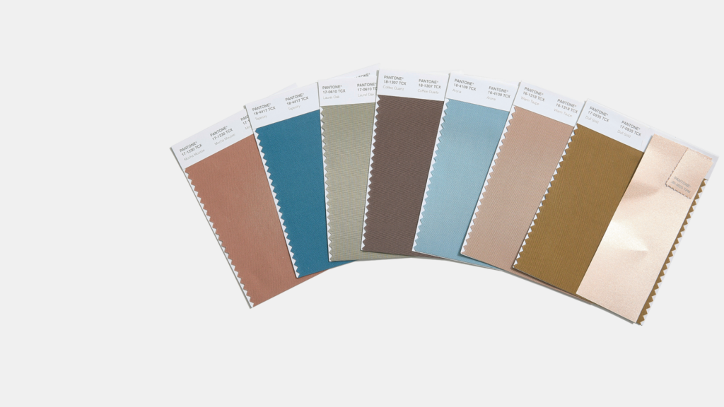
Pantone even suggests the perfect colour combinations with Mocha Mousse. (Image credit: Pantone)
Colour theory analysis: Does Mocha Mousse have potential?
Colour theory helps us understand how colours interact and influence emotions, making it a valuable tool when styling a shade like Mocha Mousse.
The impact of this chocolatey hue is depending on the palette you pair it with.
For instance, pairing Mocha Mousse with lighter neutrals like cream or beige creates a serene, harmonious look — ideal for spaces where you want to unwind.
But, ensure that the textures are all different or exciting to make it visually interesting. Without texture you may fall into the realm of drab and uninspired.
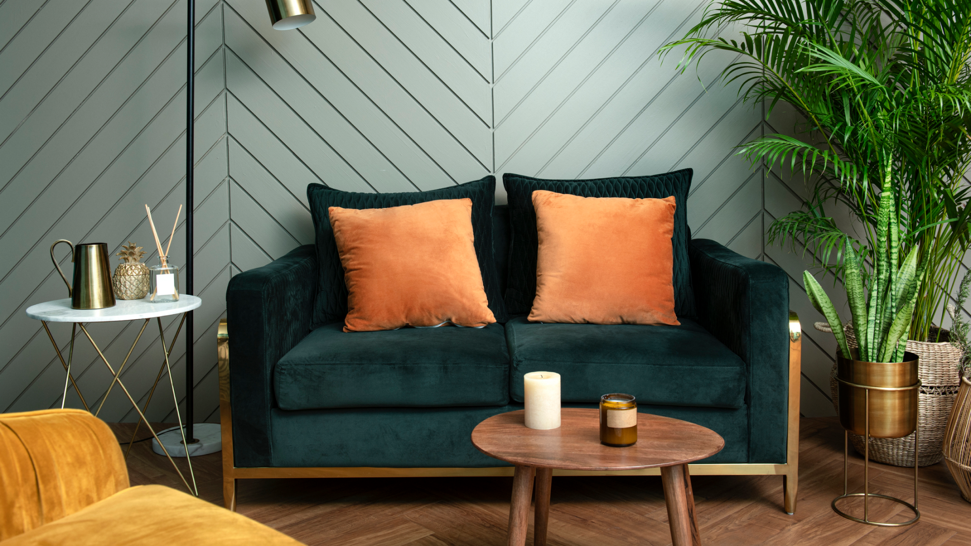
On the other hand, contrasting Mocha Mousse with bold accents like deep green or burnt orange can energise the room, making it feel vibrant and full of personality.
The balance can be tricky, and finding the right shades and quantities might require trial and error.
The finish and texture of Mocha Mousse elements can also influence its effect.
A matte-painted wall in this shade lends a cosy, grounded feel, while incorporating it through glossy ceramics or velvet fabrics adds a luxurious touch.
In rooms like the kitchen or bathroom, introducing this shade in small doses, such as tiles or accessories, can prevent it from overwhelming the space.
Ultimately, styling Mocha Mousse is all about balance.
Use it as a dominant colour for larger pieces like sofas or walls, and pair it with complementary hues for visual interest.
Alternatively, keep it as a subtle accent through smaller accessories to highlight other design elements.
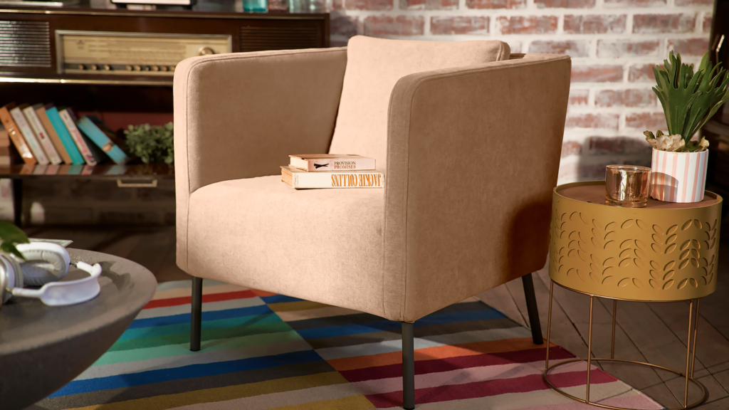
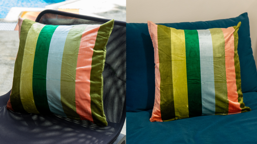
With the right styling, most shades of brown can look vibrant in your space. (Image credit: Comfort Works)
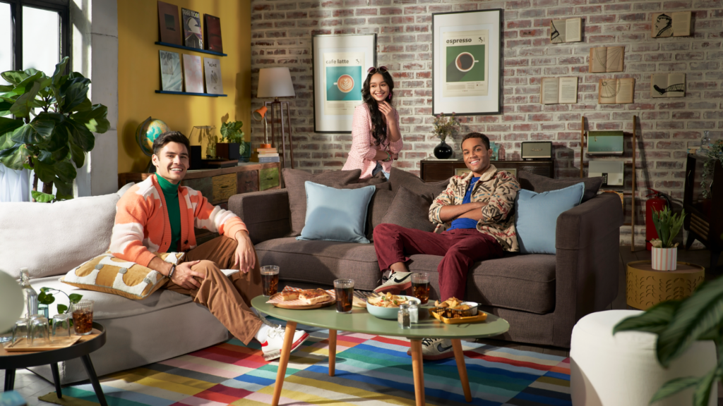
Practical ways to integrate the Pantone Colour of the Year into your home
Start small with accents
If you’re not ready for a full-scale transformation, start with smaller touches:
Throw pillows and blankets: Add a cosy layer of Mocha Mousse to your living room or bedroom with soft furnishings that can be easily swapped out.
Slipcovers: Comfort Works offers slipcovers in a variety of shades, including neutral tones. Refresh your sofa or armchairs with a sleek new look that blends practicality with style. (Keep an eye on our social channels — next year, you’ll be slipping into the cosy charm of Mocha Mousse with Comfort Works!)
Rugs and curtains: Frame your room with Mocha Mousse by choosing curtains or rugs in this shade. This will create a subtle backdrop for your existing decor.
Decorative accents: From vases and lamps to picture frames, sprinkling this warm brown hue across your space ties everything together.
Go bold with walls or furniture
For those feeling adventurous, consider making a larger statement:
Paint a feature wall: Transform an entire room’s vibe by painting a single wall in Mocha Mousse. Pair it with creams or off-whites for a clean, sophisticated contrast.
Upholster your furniture: Revamp your dining chairs, ottoman, or even headboard with fabrics in Mocha Mousse to create a cohesive and luxurious feel. Or you can check if we can slipcover your furniture, so you can change your mind as often as you like.
Getting a new sofa cover can truly transform your space. (Image credit: Comfort Works)
Room-by-room inspiration
Living room: Opt for a Mocha Mousse slipcover for your sofa, paired with light cream or terracotta cushions for balance.
Kitchen: Introduce the colour through bar stool cushions, kitchen towels, or even Mocha Mousse crockery for a coordinated look.
Bedroom: Use the hue in bedding or as a plush throw at the end of the bed to create a calming, grounded atmosphere.
Outdoor spaces: Choose weatherproof slipcovers or outdoor cushions in Mocha Mousse to extend the trend to your patio or balcony.
Bonus tip: Pair Mocha Mousse with complementary colours
Mocha Mousse shines when paired with complementary tones:
Neutrals: Combine it with off-white, beige, or grey for a timeless look.
Bold Accents: Introduce burnt orange, deep green, or gold for a touch of luxury.
Textures: Play with different materials — think velvet, leather, or linen in Mocha Mousse to add depth to your decor.
Top tip for styling your space: Have fun with it. Get experimental! (Image credit: Pantone)
In the end, should you care about colour trends like Pantone Colour of the Year?
Trends come and go, and are often as fleeting as sunshine in the United Kingdom.
Your personal style is what truly stands the test of time.
If Mocha Mousse feels lacklustre and boring, don’t use it. Opt for shades that bring you joy (yes, Marie Kondo’s axiom works with colours too).
If you have an affinity for this year’s Pantone Colour of the Year, use it and get inspired by it.
See it as an opportunity to experiment and express yourself in your space.
We all need a shake up in our routine and transforming your home with a few design choices can make all the difference.
We believe that you should make use of IKEA cushion covers for sofa styling.
The festive season is around the corner and most of us are scrambling to make our homes guest and family-ready.
It’s the finishing touches that can really make a difference to your space.
The problem is, you don’t have time to drive out and scramble through the labyrinth that is IKEA, especially when you’ve got Christmas gifts to hunt for.
For the instances where you don’t have time to grab final accent pieces to bring together your hosting vision, online shopping can save you a lot of headache.
Just for these moments, we’ve compiled a list of beautifully patterned IKEA cushion covers that may meet your needs.
Fret not, we’ve been honest and fair, so you can find the perfect accent pillow to suit your vision.
(Image credit: Comfort Works)
Why accent cushion covers?
Accent cushion covers are the unsung heroes of interior design — small yet mighty in their ability to transform a space.
Whether you’re looking to add a pop of colour, introduce a new pattern, or simply freshen up a tired-looking sofa, cushion covers are a quick and affordable way to revamp your room.
There are endless patterns, textures, and colours to choose from, you can swap them out with the seasons or whenever the mood strikes.
Spring florals, autumnal tones, or festive prints — there’s an accent cushion cover for every occasion.
For those who love a spontaneous purchase, cushion covers are the perfect last-minute addition to your IKEA haul.
They’re budget-friendly, lightweight, and easy to add to cart without much worry about size as you can get the inner cushion for around USD 4.
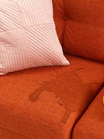
Beyond aesthetics, cushion covers are also practical.
They’re easier to clean and effortless to replace, especially if you have kids or pets in the house.
Spilled coffee or muddy paw prints? No problem. Just toss the cover in the wash or swap it out for a fresh one.
Better still, if your sofa has a Comfort Works slipcover then cleaning up these sofa messes is even easier because of our EzGuard technology.
(Image credit: Comfort Works)
From patterns to performance: How we judged IKEA cushion covers
We’ve chosen fun, patterned and colourful cushion covers from the Swedish homeware brand.
Naturally, they are the ones that were quickly sold out so you have a higher chance of nabbing one in time.
While they make for the best accent cushion covers, they may be trickier to style.
For this review we focused on lighting, and explored:
How do these IKEA cushion covers look in natural light compared to indoor lighting?
Do the colours change depending on the lighting?
Can different lightings highlight flaws?
Should we avoid certain colours based on lighting?
What sofa colours may pair best with these covers?
Texture is another crucial factor, especially if you’re buying online and won’t get to have a feel until it arrives at your door step.
All the photos we have taken were without any special lighting so you have a more realistic idea of what these IKEA cushion covers look like in natural sunlight and indoor lighting.
We want this to be especially useful for those who have aversions to certain textures or need cushion covers that pair well with their sofa material.
This review keeps in mind those of us who prefer furniture and accent accessories that are easy to maintain.
We looked at if covers need ironing and can they be scratched easily.
We’ve even asked, ‘Can IKEA cushion covers be washed?’ and made a note of the washing instructions for you.
With our living room styling expertise, we’ve crafted this guide to help ease your shopping experience.
Price: USD 8.99 (currently discounted to USD 4.99)
Material: 100% cotton
Machine wash warm, normal cycle.
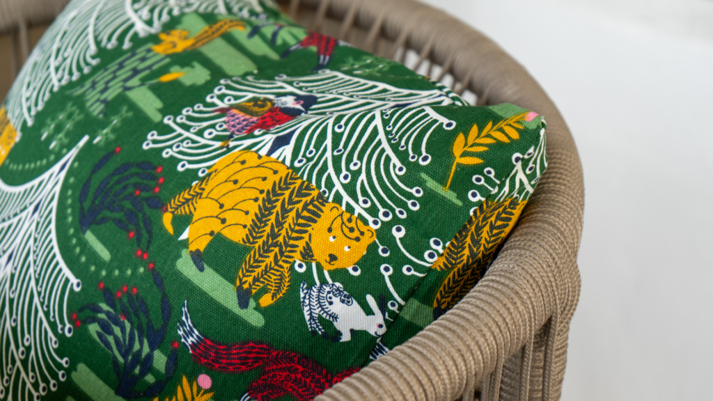
Naturally we’ve started with one of the most festive IKEA cushion covers.
Designed by Cecilia Pettersson, this detailed cushion cover features the artist’s impression of the Swedish winter landscape.
There is so much to look at — from the artistic woodland creatures to the expressive foliage, it feels like a fairytale reimagined as home decor.
“The designs are influenced by folk art, and I hope they evoke anticipation for the celebrations and a desire to wrap gifts, decorate and set tables with extra festive touches,” says Pettersson.
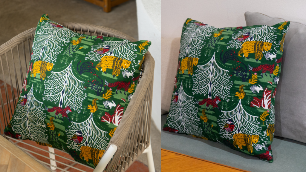
VINTERFINT outdoor (left) and indoor.(Image credit: Comfort Works)
The zip is thoughtfully at the bottom of the design so you do not have to worry about its visibility.
With natural or indoor lighting, the traditional Christmas hues of this piece still feel energetic.
This cushion cover makes the perfect accent piece for any sofa or chair colour.
However, it would be most striking on an amber/mustard yellow or forest green sofa.
The VINTERFINT feels rustic but may be a little tricky to style all year.
Styling it outside of yuletide celebrations could be a fun adventure to challenge your interior styling prowess.
Although you have to wrestle its cover on, the final result truly makes this cushion cover worth the trouble.
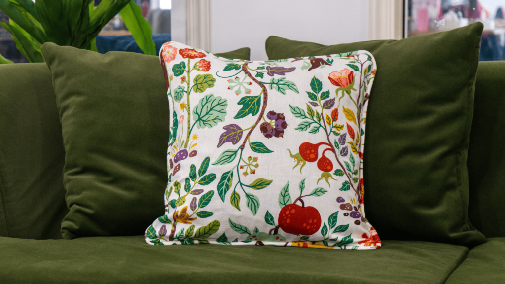
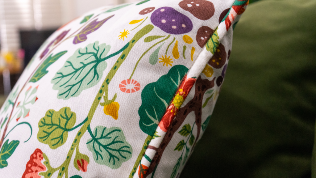
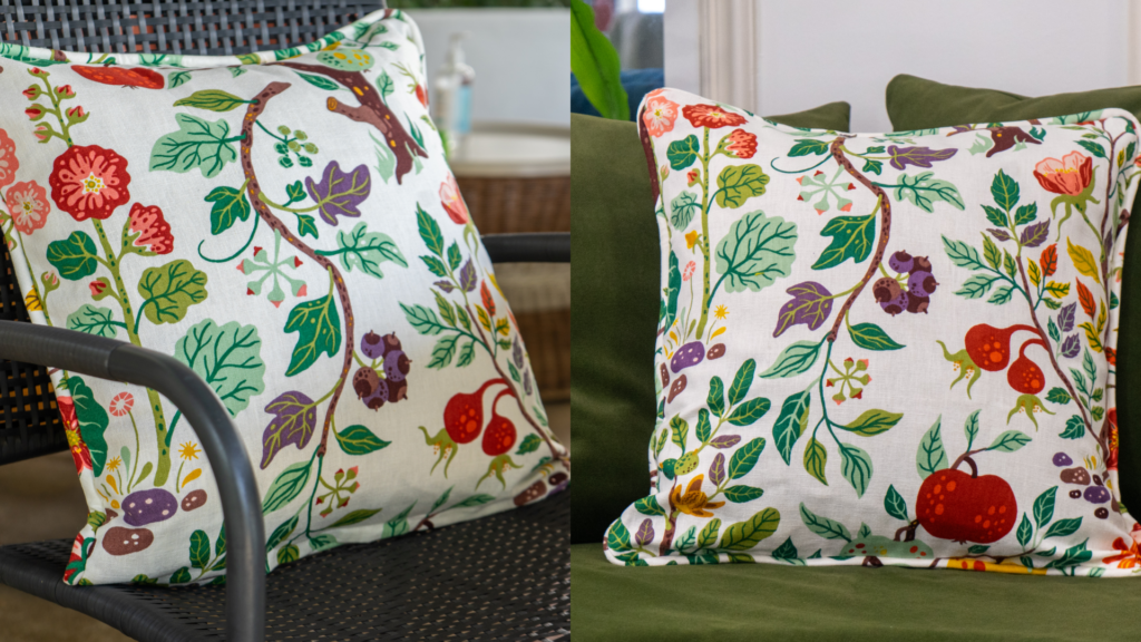
Giving cottage core and plenty of whimsy, VILDPERSILJA can add a splash of colour to your space (If you choose the black variation you will be treading onto whimsigoth territory).
With such a clean background, the plants and fruit look like they’ve come straight out of an artistic children’s picture-book.
Fret not, this does not mean that this pillow is child-like in style, but rather lends itself better to floral and maximalist spaces.
The addition of piping around the edge of the cover even adds sophistication and softness to its overall design.
VILDPERSILJA outdoor (left) and indoor.(Image credit: Comfort Works)
As it is a cotton linen blend, it has a rustic feel but it’s not rough — this cover is huggable and gentle to the touch.
In terms of lighting, this cushion cover stays consistent indoors or outdoors.
To style this cover you can play more with texture — a neutral beige or white sofa can act as the base as you layer a textured throw or two and complete the look with this whimsical cushion cover.
If you’ve got a coloured armchair, ensure that it is one of the shades found on the pillow for a seamless match.
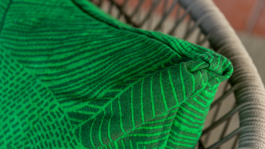
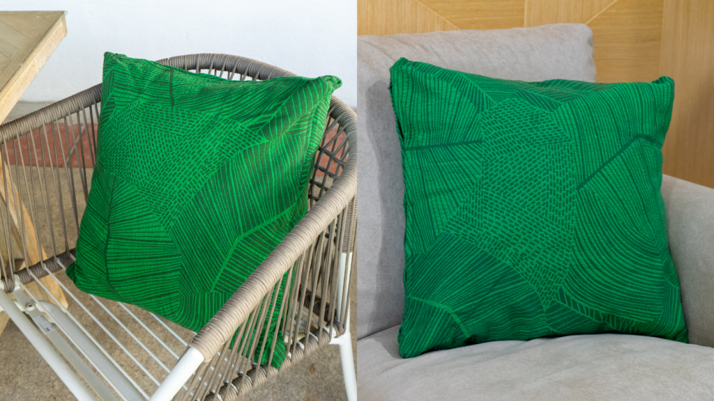
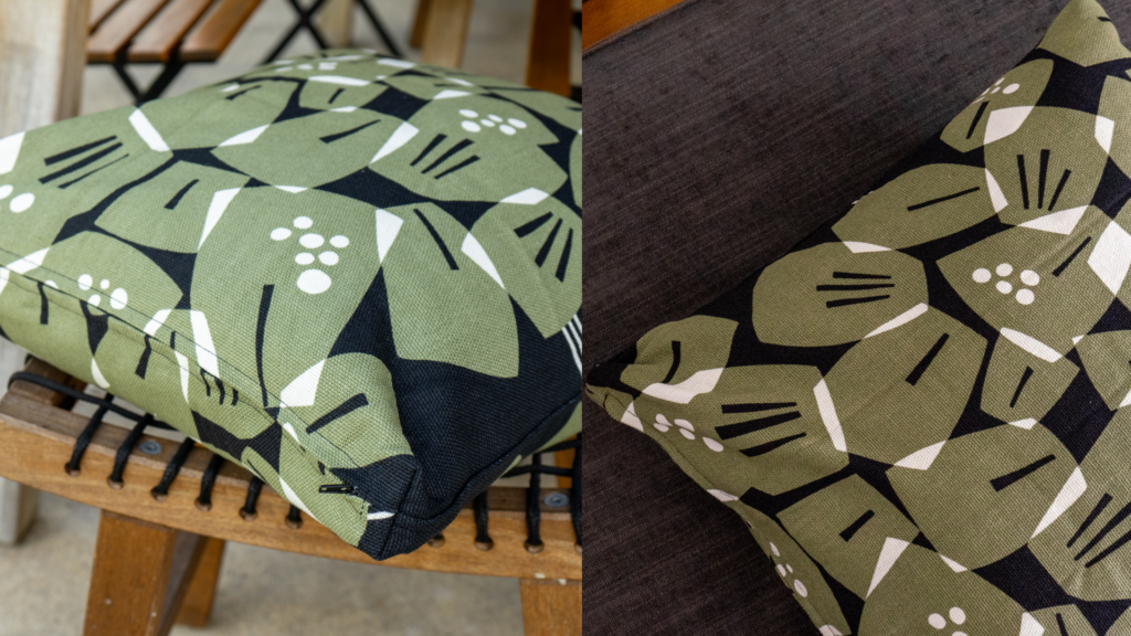
This lively and refreshing green IKEA cushion cover was a no-brainer when we saw it.
It is textured, patterned, and comes in an energetic shade of green, one that is very versatile for interior design.
In fact, with this colour you should simply avoid a green sofa of the same shade as that matchy look can feel outdated.
(Keep in mind that there is also an off-white and red-orange variation).
The jacquard weave texture is nature-inspired, lending itself to creating a warm space with depth.
The tactile feel of the pillow is also akin to nature, mimicking the lines on leaves as seen behind a microscope.
JÄTTEGRAN outdoor (left) and indoor.(Image credit: Comfort Works)
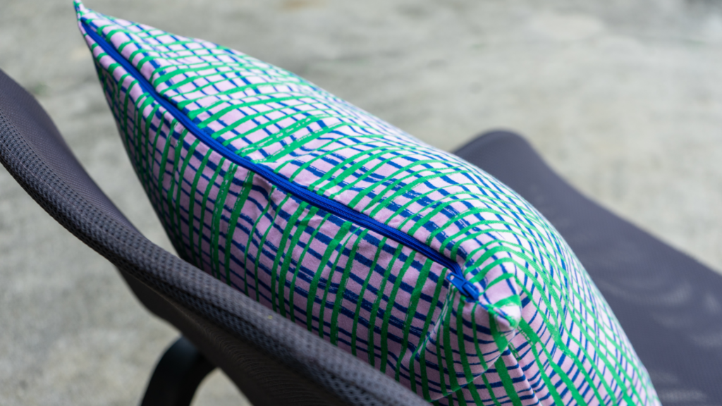
This case has squared-off edges and fits a little loosely on the cushion. While this is meant to create a more boxy shape, it instead just looks loose.
This doesn’t completely deter itself from our list, but perfectionists who need neat and clean lines should opt for one of our other choices.
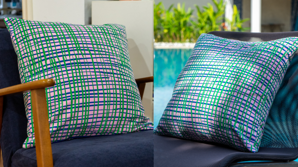
The sturdy composition of this cotton cushion case makes it suitable for indoor or outdoor, but the vibrancy of its colour does slightly change in different lighting.
Indoors, the beautiful green fits on the sofa cover, from a muted grey to a sunny yellow.
In natural sunlight, the green really pops, making it a stunning accent piece for your couch.
We would then recommend more neutral background colours so it can be the star of your arrangement.
SVARTPOPPEL outdoor (left) and indoor.(Image credit: Comfort Works)
Price: USD 4.99
Material: 100% polyester (min. 90% recycled)
Machine wash warm, normal cycle.
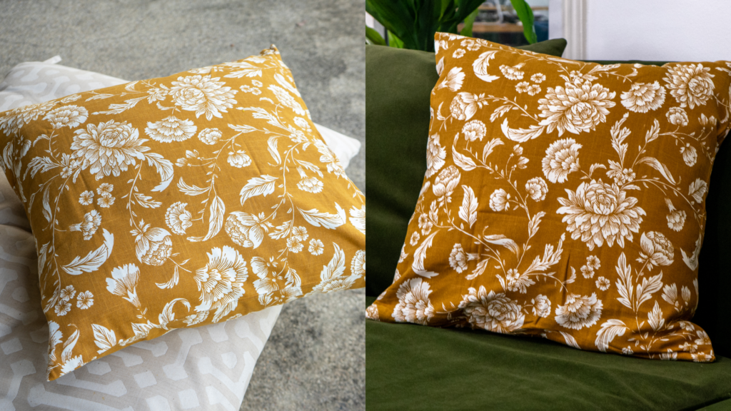
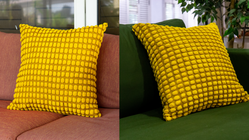
While there are many colours of SVARTPOPPEL, we could not resist this pocket full of sunshine.
The visual texture of this piece can really invigorate your sofa, but it is not too extra, making it fitting for a year-round aesthetic revamp.
This pillow cover is fun to look at and feel. It is soft and huggable, reminding us of the Monster’s Inc. character Sully, and what could be more comforting?
Other than the elegant zip design, a great bonus is that you will never have to iron it making it a fuss-free choice.
IKEA’s SVARTPOPPEL.(Image credit: Comfort Works)
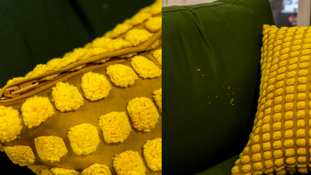
However, we did notice quite a bit of shedding when we moved it around. With a trusty lint roller (which most pawrents are best friends with) you have an easy fix.
We found that in the sunlight, this bright accent piece can turn a touch garish, so styling will become key.
A more subtle sofa cover can balance out some of the pure sunshine that this cover emits, but do not opt for shades that are too dark as the contrast might make it feel very loud.
Styling for indoor lighting is a lot easier as it is easier on the eyes.
If you have a dark green or neutral blue couch, this particular shade of yellow will be perfect.
MÄVINN outdoor (left) and indoor.(Image credit: Comfort Works)
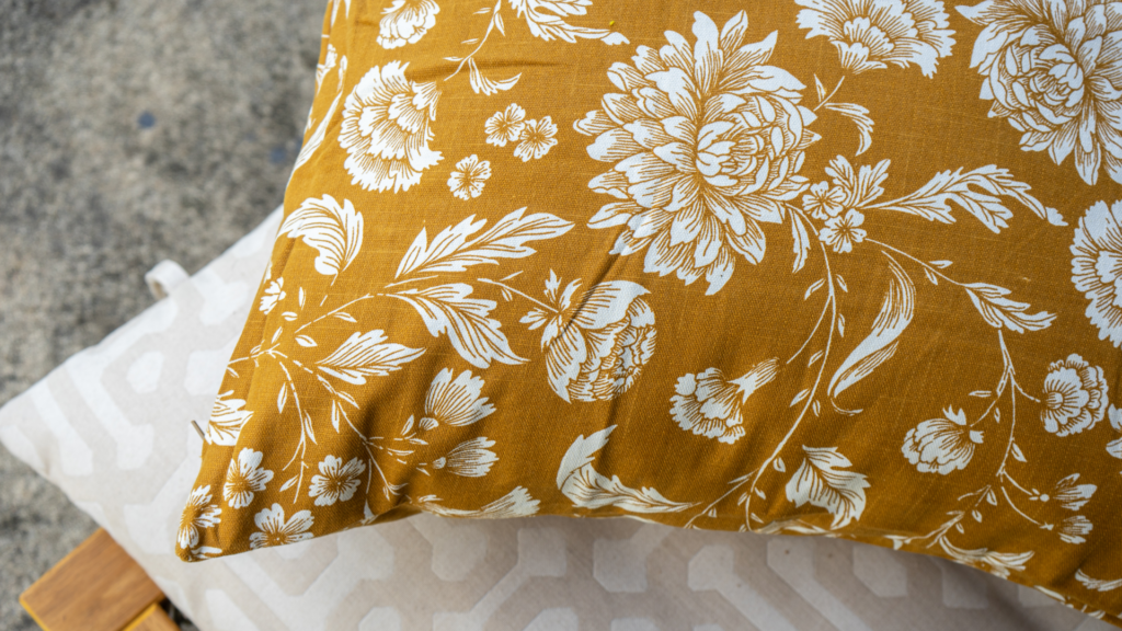
Price: USD 14.99
Material: 100 % cotton
Machine wash warm, normal cycle.
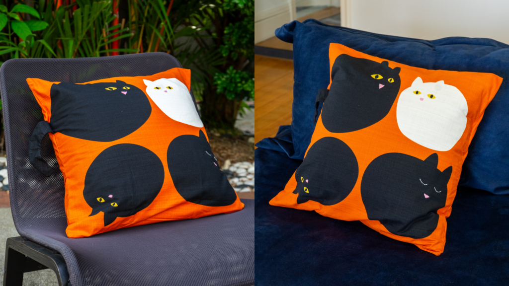
We have saved the best, and most meaningful, for last.
You may think that ‘meaningful’ is an odd attribution to give a cushion cover, but this one is special.
IKEA often collaborates with social enterprises such as this to make an impact on the world that is positive.
MÄVINN is handmade by the social business Jordan River Foundation, which provides long-term livelihood for female artisans, Jordanians as well as Syrian refugees.
This organisation provides economic empowerment for these women.
This won’t be the only aspect to sway you towards this accent cover.
IKEA’s MÄVINN.(Image credit: Comfort Works)
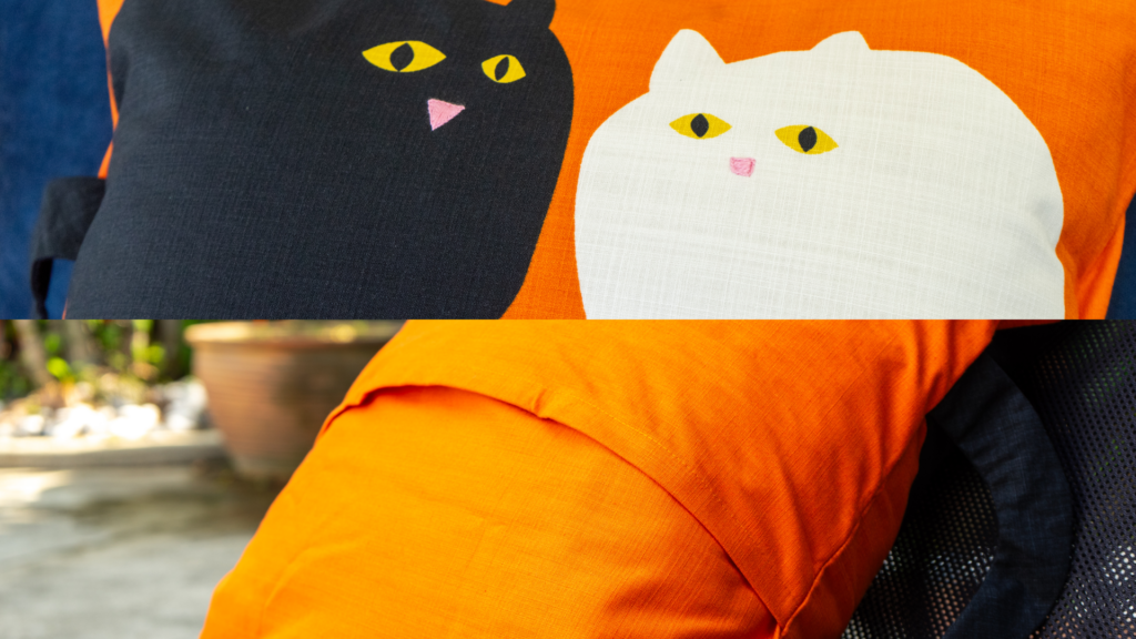
Close inspection reveals a cross hatch pattern and detailed hand-sewn elements that make it unique.
The cats have nose and eye details that are elevated, offering a tactile pleasure and a visual treat.
The added tail that hangs off the cover is a fun feature, although pet owners should consider that this may become their favourite toy to gnaw or scratch at.
In the sunlight, the orange really pops and the shocking orange contrast to the black and white cats give an almost halloween feel with indoor lighting.
In either setting this envelope style pillow cover might be the best conversation starter for the holidays.
Want to completely refresh your space? Invest in a Comfort Works sofa cover that is performance driven.